Epicentar
Branding + Identity
Branding + Identity
Epicentar (epicenter) is a club in Skopje, Macedonia - a city oftenly hit by earthquakes. In fact, 1963 hosted one of the most devastating quakes in our history, flatting our city to the ground. The city was rebuilt again by Kenzo Tange’s plan (featuring lots of iconic, brutalist buildings), a symbol of a new and modern era.
Epicentar is a reflection of that time. The club’s idea is recreating a progressive and modern club scene, promoting not just international stars but local talent as well.


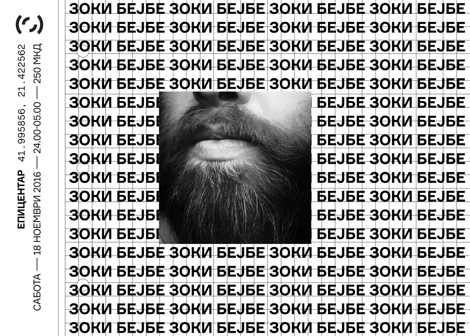
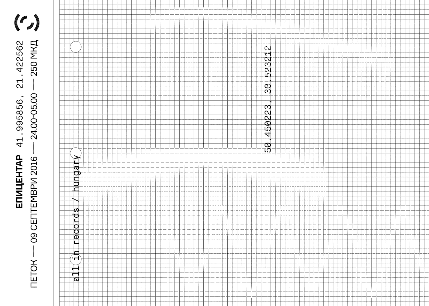
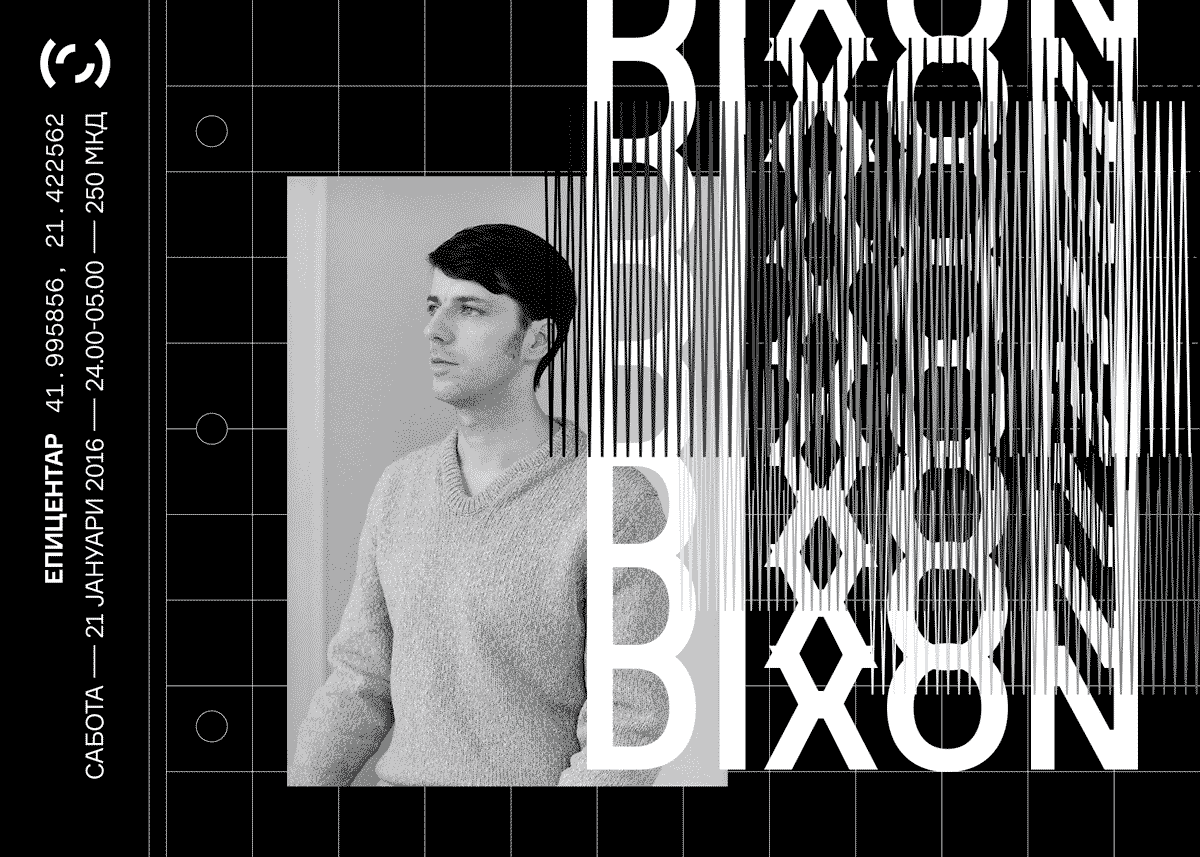
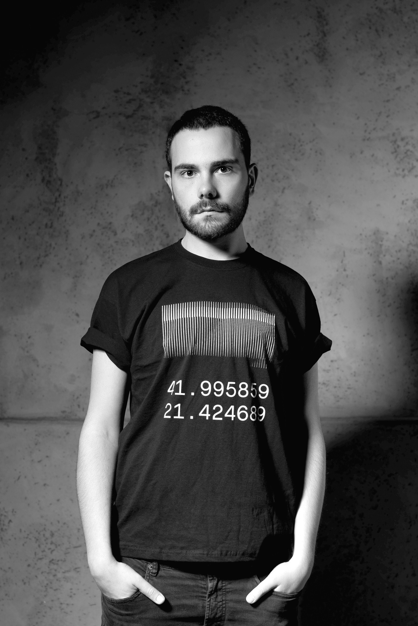
As a main logo, we used numeral coordinates of the club location. In the posters, we also use the coordinates from the hometown of each visiting artist. The alternative symbol is an iconic, always moving, radial shape which points to where the Epicenter is.


POSTERS
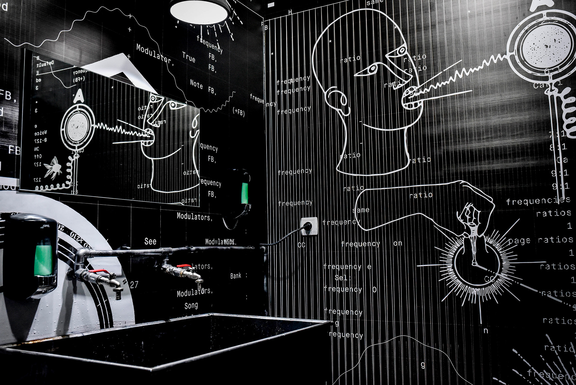
The theme in our design layouts is based on graphics used in the technical paper sheets (horizontal) for measuring earthquakes (such as waves, diagrams, schemes, data, grids etc). The noisy and distressed visuals are meant to recreate the disturbed and uneasy feeling of an earthquake.